I have created various static plots that show the transformation of choreographer Katherine Dunham’s dance company configuration as the company toured around the world that demonstrate the change of the company demographics over 30 years. In this post, I talk about how I built an interactive visualization that digitally represents the evolution of the company composition at an individual level, in a process that started two years ago and still keeps going as of today. I begin by describing early experiments with a sankey diagram to model the in- and out-flows of Dunham's performers. I then discuss my specific innovations of structuring the diagram as an emergent timeline, implementing multiselection to extend interactivity, and trimming its edges to increase readability. Finally, I conclude with enhancements I made to improve usability, including the addition of magnification and search functionalities.

Figure 1. Sketch of personnel flow by Kate Elswit
As explained in a previous post by Kate and Harmony, they began with the idea of the “check-in” to describe patterns of performers coming in and out of the company. We identify a check-in when we have evidence that a performer was located in a specific place on a specific day, mostly from company programs, payroll, letters, and other paperwork that we have gathered from Dunham’s archives.[1] For Kate and Harmony, these links show potential lines of body-to-body transmission of dance-based knowledge within the company. Figure 1 is the sketch that Kate made during a team meeting to explain how she envisioned a depiction of personnel circulating through Dunham’s company.
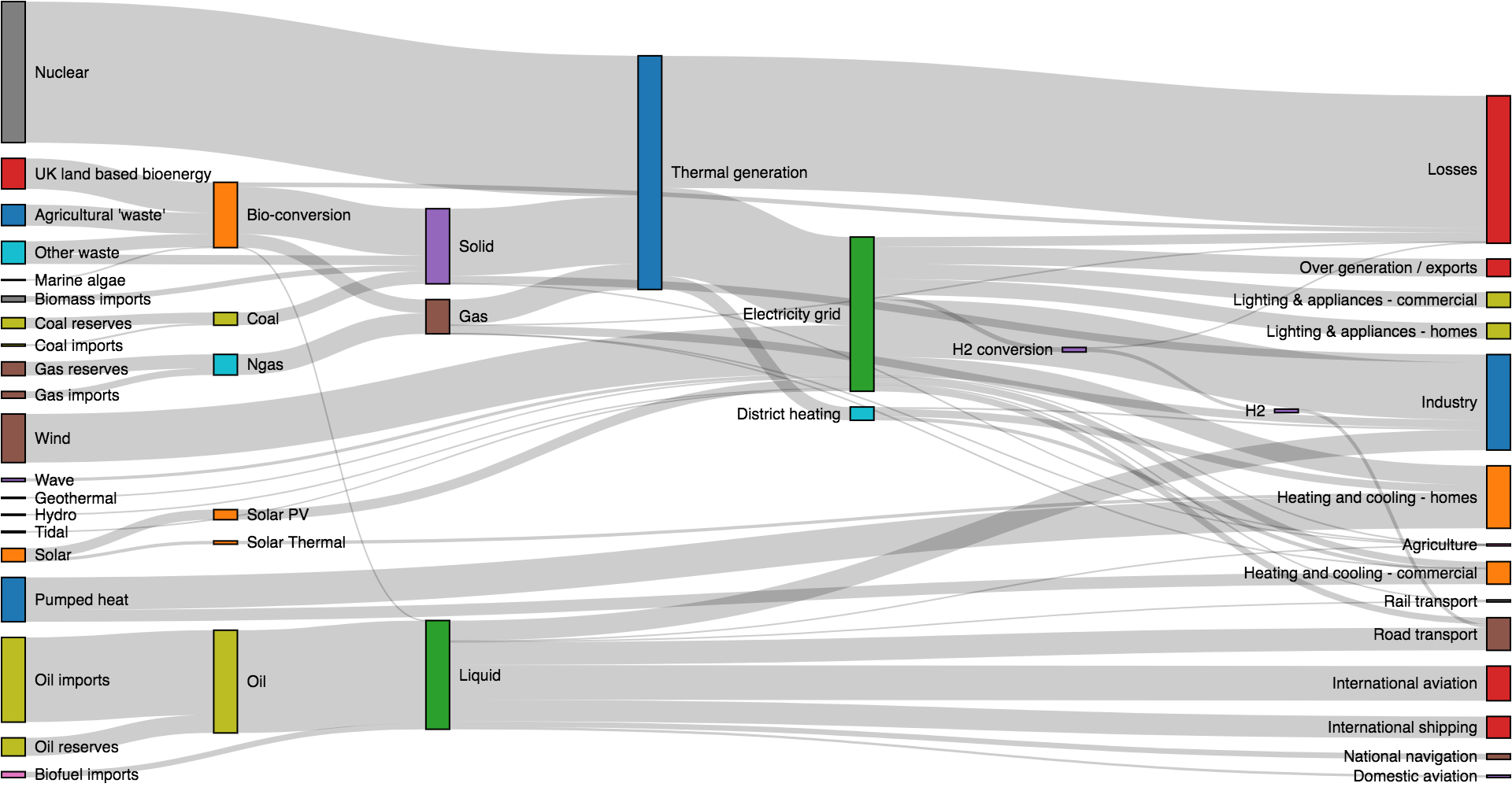
Figure 2. Example of typical sankey diagram
A natural way to represent flows is by means of a sankey diagram, a type of flow chart where the width of a link is proportional to its stream quantity, and the nodes are arranged so that the number of crossing between links is minimized (see Figure 2). I adapted a regular sankey diagram to our case study so that each link corresponds to the trajectory of a performer all along, and therefore, all the links are 1-unit wide. I placed the performers on the edges (two nodes per performer—one on the left side when joining the company and one on the right when leaving) and used the intermediate nodes for each of the check-ins. In order to track more easily when the performers join and leave the company, I brought their nodes closer to their first and last check-in, respectively, which forms a shape that we informally call “centipede” (see Figure 3 for a comparison).[2] Another peculiarity of this custom version is that, as every check-in happens on a specific day, a series of consecutive check-ins form a temporal sequence, similar to a timeline. This use of sankey diagrams in a timeline fashion is very unique for this type of diagram, and in our case, it demonstrates multigenerational connections across company members.
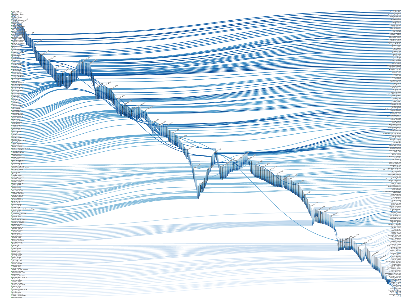

Figure 3. Dunham’s personnel flow diagram: regular (top) vs centipede (bottom)
Figure 4 highlights the trajectory of a selected performer, Julio Mendez. This is possible because, unlike the static visualizations mentioned at the top of this post, this plot enables user interaction. The value of interactive visualizations in the humanities stems from their ability to support interpretative activity based on data exploration and discovery, opening up new questions and new scales of research. For example, in this aforementioned post, Kate and Harmony analyze the trajectory of Julio Mendez. Informed by the outcomes produced during exploration (for instance, any oddness detected in this or any other performer’s flow pattern), they might revisit previous steps at later stages, including auditing the data or requesting new functionalities. From my designer perspective, I have to handle this type of visualizations with care and be ready for feedback and later modifications.

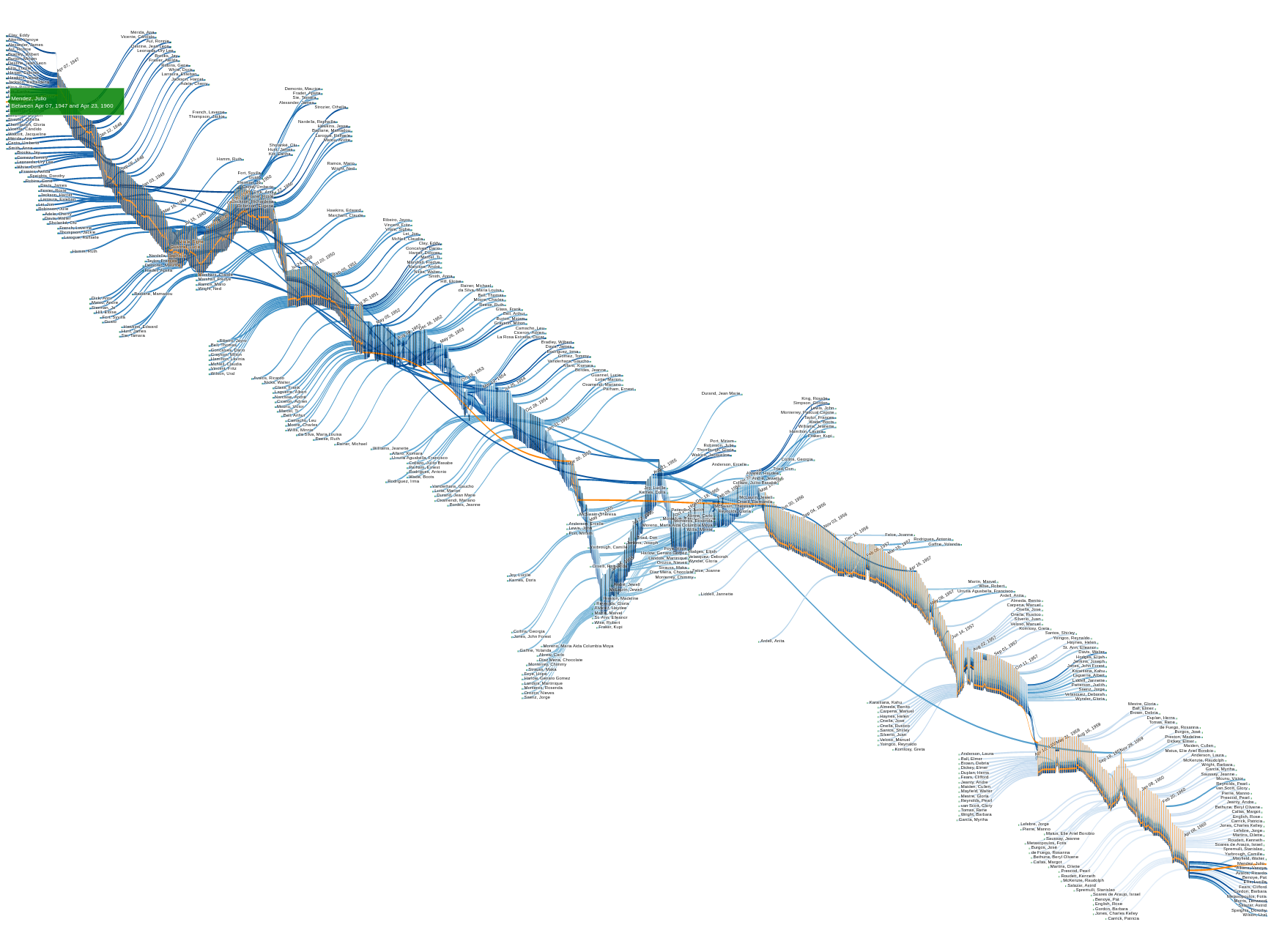
Figure 4. Dunham’s personnel flow diagram: section (top) and full (bottom), with performer Julio Mendez highlighted
Signs of this iterative development are my implementations of the centipede layout and the performer multiselection. To the best of my knowledge, these features do not exist in any other sankey diagrams. The centipede arrangement is a characteristic that obeys the need to reduce the visual complexity to increase understanding. For its part, the performer multiselection is a functional requirement that Kate and Harmony asked me to implement. Whereas sankey diagrams typically only highlight individual nodes/links on hover and unhighlight them on mouse out, Kate and Harmony wanted to select multiple performers and, this way, juxtapose their trajectories within the company to see who shared space and time together, or, conversely, to understand how repertory might connect many performers who never danced together. Figure 5 shows the performers of Veracruzana, a piece of Dunham’s repertory with a cast of 15 people. Kate and Harmony clicked on and selected the 53 performers of the company that ever stepped into a role in this piece. The figure depicts a flow where the company’s knowledge, embedded in the gestures and rhythms of a dance piece, is potentially transmitted intergenerationally across many different casts.[3]
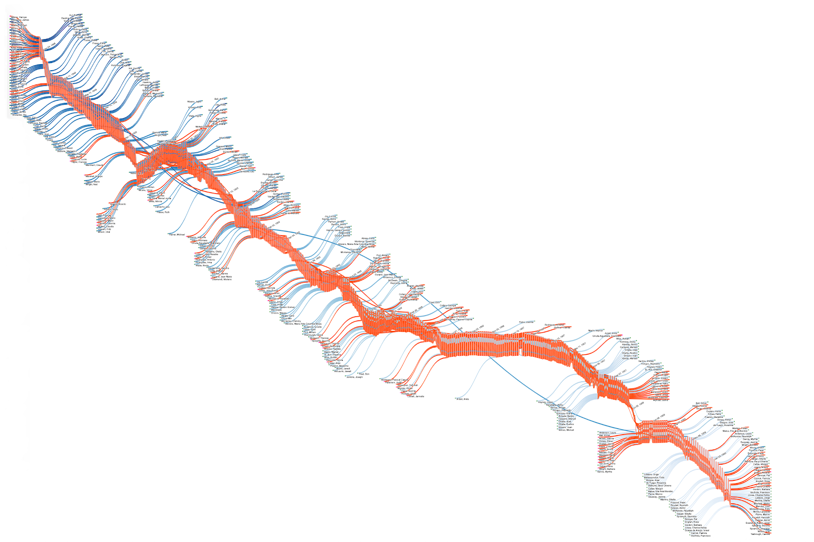
Figure 5. Veracruzana performers highlighted by Kate and Harmony
Technically, interactivity is achieved by means of web technologies. In addition to standard HTML, JavaScript, and CSS, which are necessary for fine-tuning, I mainly created this sankey diagram with Plotly.js, a free JavaScript open-source high-level declarative graphing library built on top of D3.js and Stack.gl. I manipulated a local copy of Plotly.js to customize the sankey diagram and meet our needs. At that time, I did not know how to properly extend this library’s functionality, so I directly edited its code where needed. We will release the code upon project completion, and together with it, I will publish a guide on the changes I added to Plotly.js’ source code.
Up to now, I have described a process whose result is displayed in Figures 3 to 5. It is noticeable that the sankey diagrams in them are zoomed all the way out in order to fit them to the width of this post, and therefore, the performers’ names and the check-ins’ dates are not legible. To a slightly lesser extent, I faced this same problem when I embedded this graph on a webpage (see Figure 7 for a screenshot). The consequence was that the whole project team had to play with the browser’s zoom and scroll to reconcile the big picture and the detail. The cause of this problem is our data complexity—the average sankey diagram has some dozens of nodes and links (see Figure 2 again for an example), while ours has 912 nodes (189 performers multiplied by 2 nodes per performer—incoming on the left and outgoing on the right—plus 534 check-ins) and 11,616 links. This size and the visual limitations, in addition to the insufficient available tools at that time to manipulate it, stopped us from making the most effective use of this flow diagram. Here is where usability comes into play.

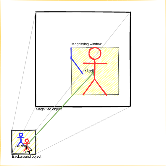
Figure 6. Magnifying window blueprint: two examples. The Figure illustrates concepts described below. These are the correspondences:
- (1) = Background object
- (2) = Magnified object
- (3) = Magnifying window
- (4) = Mouse pointer on blue stick figure (left) and on red stick figure (right)
- (5) = Green arrow
- bc = (x1, y1) (left) and (x3, y3) (right)
- mc = (x2, y2) (left) and (x4, y4) (right)
Usability is a non-functional requirement in system design that is key for a satisfactory user experience. The idea that came to my mind to make this visualization truly usable was to extend its functionality with a magnifying glass. Figure 6 shows how the magnification works. Firstly, it consists of five main components: (1, 2) two instances of the same object on two different scales that coexist in the same space—one on real scale on the background and the other one magnified on top, (3) a layer that hides the magnified instance except for a certain area, where it is visible—the visible area is properly called the magnifying window, (4) a pointer, and (5) a mapping function between the two instances. Then, wherever the pointer is positioned with respect to the background object, the coordinates of that position are obtained, bc, and based on bc, the coordinates of the same position with respect to the magnified object are calculated, mc, keeping in mind the offsets and scales of the two objects and the offset of the magnifying window—bc and mc point at the same position in their respective objects. Finally, the magnified object is moved with respect to the magnifying window (the background object and the magnifying window are fixed and they do not move) so that the area pointed by mc is displayed in the magnifying window.
Note 1: I am using instance, object, and diagram equivalently.
Note 2: An element offset or location is the position of the element with respect to the top-left corner of the webpage.
There are countless examples of magnifiers on the Internet, from which I derived the principles described above. Nevertheless, the vast majority of the examples I found are coded for static images—using HTML, JavaScript, and CSS for scaling images and repositioning them where appropriate to mimic the logic of magnification is relatively simple. I wondered if it would be possible to replicate the same behavior with other types of HTML content (a regular DIV, for example). The answer is yes, but there are not many tools available for it. I found a good jQuery-based library named jfMagnify. It is simple enough, well documented, and can be used fairly straightforwardly. However, this and other similar solutions have two decisive drawbacks. The first one is that, due to the complexity of my webpage (Plotly.js creates a complex structure of DIVs and SVGs when it generates the sankey diagram), there are many breakdowns that prevent jfMagnify from working correctly. The second one is that, even in more simple cases where jfMagnify worked properly, it does not replicate user interaction. This means that although the library clones the object and creates the magnifying structure flawlessly, the interactive functionalities (events, in JavaScript language) attached to the original object are not bound to the clone. For all these reasons, I decided to implement my own bespoke magnifier.
Following the ideas illustrated in Figure 6, I started my magnifier implementation by duplicating the sankey diagram (1, 2). My first attempt was to call jQuery’s .clone() method on the original sankey object, but it did not work. Therefore, my solution was to plot the diagram twice. This is computationally expensive (even sometimes the browser complains about too much work when loading the webpage), but it is accurate. The second step was to assign a role to each object (real-scaled on the background, magnified on top) and scale them accordingly. As I said before, our sankey diagram is too large, so the background “real-scaled” object had actually to be scaled at 30% to fit the webpage size, and the “magnified” one was not scaled at all—it can be considered magnified due to its big size. See the size difference in Figures 4 and 7. Although the sankey diagrams are decreased in size for the purpose of this blog post, the proportion is the same as on the webpage. Next, I added the layer that contains the magnifying window (3). The keys for this step are to give the layer the desired size (height and width properties), set a hidden overflow, and append the magnified object as its child. The child is predictably much larger than the parent, so this way, we can see only the part of the child that falls into the visible part of the parent, and thanks to the hidden overflow property, the excess is masked. This creates the illusion of a magnifying window.
The magnifying window (3) and the pointer (4) can be the same element, that is, either the user directly positions the magnifying window in the area to magnify (3 and 4 are the same element) or the magnifying window is placed on the side while the user moves the mouse to point at the area to magnify (3 and 4 are different elements). I chose the second option to have the background diagram always visible at any time (and never partially covered by the magnifying window while using it). Figure 6 follows this approach. Finally, the mapping function (6) calculates the coordinates in the magnified object and centers that position in the magnifying window. This short tutorial inspired me to create my magnifier. Its function moveMagnifier is roughly the formula I used in my solution.
The last step to make the magnifier completely functional is to support user interaction, namely, hovering for individual highlight and clicking for multiselection, so that we can interact with any of the flow diagrams equally and the same action is reflected on the other diagram. Upon user interaction, several nodes and links change their colors. The idea is to copy these nodes’ and links’ color attributes from the object the user interacted with to the other object. At this point, I need to know the structure of the sankey diagram generated by Plotly.js to find out how to access their components (nodes and links) and their attributes (mainly, fill color). Every node and link has a unique identifier, which is the same in both sankey diagrams. This way, by iterating over the components of the first object, I can access each component individually (node or link), read its fill color value, search for the component with the same identifier in the other object, and copy that value onto its fill color property. This operation would be quadratic (meaning computationally expensive) in principle. My solution was to previously extract and sort the list of identifiers, and then I iterate over this list instead, which makes this process linear and very efficient. Figure 7 shows the current (April 2021) version of Dunham’s flow diagram magnifier.

Figure 7. Dunham’s flow diagram magnifier
To finish this post, notice the search bar at the bottom of the instructions in Figure 7. End users of this tool will not know the location of every performer in the flow, so it can be hard to find a specific name among the 189 performers. Looking for a needle in a haystack may limit active data exploration to unexpected discovery. Therefore, it is essential to provide tools to help researchers find what they are looking for.


Figure 8. Example of search
The search bar allows the user to search for performers. It expands when active and uses predictive text to dynamically filter the list of results as the user types (see Figure 8). The result list is interactive too: on hover or click, the selected name is centered in the magnifying window and the performer’s nodes, check-ins, and links are highlighted in both diagrams accordingly. That is, interacting with a name on the list simulates the same interaction on the background diagram (and then replicated on the magnified one). This is possible because JavaScript has mechanisms to trigger an event on an element, even if the user is not directly interacting with it. The search bar, along with the magnifying feature, also improves the flow diagram usability.
In conclusion, scholars can find in this flow diagram a powerful tool to track performers in Dunham’s company, contrast their trajectories, study in- and out-flow patterns, and understand their connections through company repertory. I used a sankey diagram to represent the company flow, but due to our data’s complexity, I applied some modifications: 1) trimming the edges to increase visual understanding and readability, 2) extending interactivity by implementing multiselection to better accommodate data exploration and argumentation, and 3) adding magnification and search functionalities to enhance usability and make the most of this visualization.
[1] For more on the development of the dataset, see Harmony Bench and Kate Elswit, “Dance History and Digital Humanities Meet at the Archives: An Interim Project Report on Dunham’s Data,” Dance Research 38.2 (2020): 289-295.
[2] Thanks to project advisor Jonathon Bollen for encouraging the team to think about foregrounding individual trajectories.
[3] For more on this topic, see Kate Elswit and Harmony Bench’s forthcoming essay, “Visceral Data for Dance Histories: Katherine Dunham’s People, Places, and Pieces, 1947-60.”